The figure below shows the evolution of two investments. Which one do you prefer? the one on the right? I knew it. The left one is far too volatile, this enormous price drop is really unbearable.
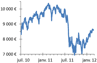
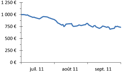
Figure: The evolution of two investments.
Yet, the two charts show exactly the same thing: the evolution of the CAC 40 index of French shares in 2011. So why did you jump on the one on the right? Because it has a narrower time scale and a longer y-axis, while the other one is the opposite. The 30% drop during the summer of 2011 is almost invisible on the right, where one at most sees a slight decline. Beware of this kind of graphic trick.
Moreover, the amounts are different. On the left, the original investment being €10 000, the loss is €3 000, while the right graph with its initial investment of €1000 seems to lose only a tenth of that.
You will also notice that on the left figure, the final value of the index is equal to its initial value. Sure, there was a 30% drop (including a steep 20% tumble in a little over a month), but in a year and a half there has been no loss. A sharp price drop need not have long-term consequences.
